Illustrations and experiments supplimentary to the excellent modeling mindsets by Christoph Molnar.
Author
Lennard Berger
Published
July 31, 2023
Time to test some students (statistical modeling)
Interior of a classroom, students bent at study, Yallourn, 1947.
Some while ago I read a fantastic book titled Modeling mindsets by Christoph Molnar. It prompted an idea to reiterate on a problem that is as old as any stastician’s playbook: student exams. Writing exams is difficult. However, a statistician may claim, modeling an exam result is fairly trivial. Bear with me for a moment, and you’ll see there is more to this simple problem than you might expect.
Exam scores
Exam scores are a popular choice in many statistican textbooks. That’s because it is largely accepted that they follow a normal distribution (hence the term student’s t-test). As they saying goes: the proof of the pudding is in the eating. To demonstrate how to model exam results, we will use a dataset of 1000 fictional exams created with Rocye Kimmon’s excellent exam scores generator. We can display the first few rows to get an idea of what data it contains.
Code
from IPython.display import display, HTMLimport pandas as pddf = pd.read_csv("exams.csv")df["overall score"] = df[["math score", "reading score", "writing score"]].mean(axis=1)display(HTML(df.head().to_html(index=False)))
gender
race/ethnicity
parental level of education
lunch
test preparation course
math score
reading score
writing score
overall score
female
group A
some high school
standard
none
43
52
53
49.333333
female
group E
high school
free/reduced
none
58
53
54
55.000000
male
group C
associate's degree
standard
none
66
72
68
68.666667
female
group D
associate's degree
standard
none
76
86
85
82.333333
male
group C
master's degree
standard
none
68
70
69
69.000000
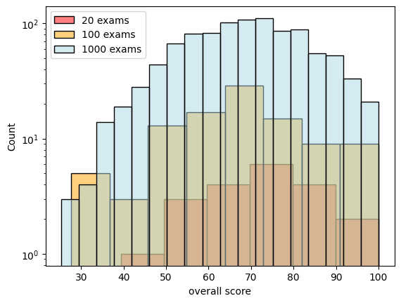
For good measure we should perform a visual inspection of our data as well. We can draw different sample sizes of our original dataset to illustrate issues that can arise with the number of observations we make.
Figure 1: Different sample sizes of a fictional student exam dataset
From above’s chart we can see that our chosen distribution captures our experiment more approximately with a larger sample size. This is fairly unsurprising. I may claim that anyone who came within two inches close to statistics should have heard about this before.
Lets get some measuring tape (frequentism)
If it is so evident that our chosen distribution approximates our experiment, just how large does the sample size needs to be? What sounds like an innocent question, could be the substance of ample discussion. For all but the simplest experiments, science usually resorts to empiricism. Experiments are repeated until we think they do what we need them to do.
Girl wearing reflective pink sunglasses with an excited facial expression
Being a linguist by profession, this is the preferrential paradigm I have been thaught, as well as for much of modern evidence-guided scientific research. The playbook for estimating evidence is relatively well established. You’ll have to stick to the following steps in order:
Formulate a hyphothesis
Observe some data in the wild
Perform a hyphothesis test suitable to your hypothesis
Estimate a confidence interval (“how certain can you be that you’re really certain?”)
On to it then, let’s not waste any more of our precious time! 🚆
Code
import numpy as npimport scipy.stats as statsrows = []for size in sizes: x = df.sample(size, random_state=42)["overall score"] k2, p = stats.normaltest(x) rows.append((size, p, k2))test_df = pd.DataFrame(rows, columns=["size", "pvalue", "statistic"])fig, ax = plt.subplots()ax.set(yscale="log")ax = sns.barplot(data=test_df, x="size", y="pvalue", ax=ax)#ax.errorbar(data=test_df, x="size", y="mean", yerr="sd", ls='', lw=3, color="black")plt.show()
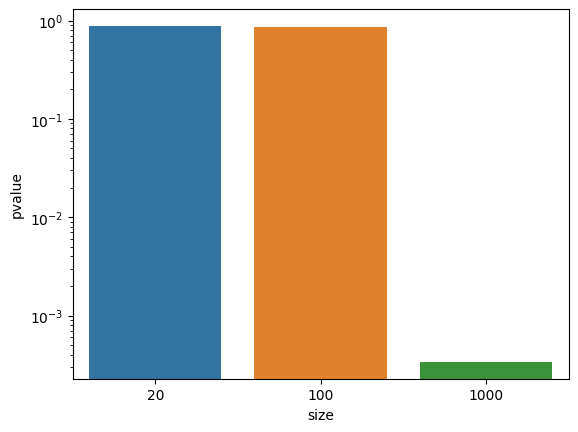
Figure 2: Confidence intervals for different sample sizes of a fictional student exam dataset
We formulate our null hyphothesis of exam scores following a normal distribution. We then perform a Pearson test for different samples sizes of the original distribution. This test returns a 2-sided chi squared probability for every sample. If the significance level of p = 0.05 is not reached, we would reject the null hyphothesis. In our example this is the case only for n = 1000.
From assumptions to assertions (Bayesian statistics)
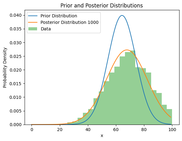
Since we have a firm theoretical understanding of exams, another way to infer model parameters could be used. We could assume the distribution of student exam scores to be a normal distribution (our prior distribution). We use the observed sample to adjust the prior distribution, which yields the posterior distribution. We can then use this updated distributions to make predictions for us. This solution is elegant when the problem is well studied, and the parameters of the model vary naturally (a student’s score distribution is a fine example). To illustrate, we set the prior mean to 65 and the standard deviation to 10 (from visual inspection). We can use pymc3 to obtain a posterior, and plot this against the original data.
Code
import logginglogger = logging.getLogger('pymc3')logger.propagate =Falsefrom IPython.utils import iofrom scipy.stats import normimport pymc as pm# Define prior parameters from visual inspectionprior_mean =65# Prior meanprior_std =10# Prior standard deviationdata = df["overall score"]def posterior_distribution(mu, sigma, sample: np.ndarray) ->tuple[float, float]:# Define the modelwith pm.Model() as model:# Define prior distributions prior_mean_dist = pm.Normal('prior_mean', mu=mu, sigma=sigma)# If the population standard deviation (σ) is known, you can specify it here as a constant.# If it's unknown, you can use a prior distribution for σ as well.# Define likelihood (assuming a normal distribution for the sample) likelihood = pm.Normal('likelihood', mu=prior_mean_dist, sigma=np.std(data), observed=data)# Perform inference trace = pm.sample(len(data)) # Run MCMC samplingreturn trace.posterior.prior_mean.mean().item(), trace.observed_data.likelihood.std().item()# Generate x values for plottingx = np.linspace(0, 100, 100)# Calculate the prior and posterior distributionsprior_dist = norm.pdf(x, loc=prior_mean, scale=prior_std)with io.capture_output(stdout=True, stderr=True, display=True) as captured: posterior_mean, posterior_std = posterior_distribution(prior_mean, prior_std, df["overall score"]) posterior_dist = norm.pdf(x, loc=posterior_mean, scale=posterior_std);
Auto-assigning NUTS sampler...
Initializing NUTS using jitter+adapt_diag...
Multiprocess sampling (4 chains in 4 jobs)
NUTS: [prior_mean]
Sampling 4 chains for 1_000 tune and 1_000 draw iterations (4_000 + 4_000 draws total) took 1 seconds.
Code
# Plot the prior and posterior distributionsplt.plot(prior_dist, label='Prior Distribution')plt.plot(posterior_dist, label=f'Posterior Distribution {size}')plt.hist(data, bins=20, density=True, alpha=0.5, label='Data')plt.xlabel('x')plt.ylabel('Probability Density')plt.title('Prior and Posterior Distributions')plt.legend()plt.show()
Figure 3: Prior, posterior and actual data distribution of a fictional exam dataset
This shows us, for well-studied problems we can approximate them statistically, which saves us time and compute. As previously demonstrated, the larger the sample, the better.
One evidence to rule them all: likelihoodism
Taking the previous ideas one step further we could postulate that observation alone serves as the true source of modeling. This idea can be formulated as likelihoodism. It’s conceptually elegant. No need to postulate hyphotheses or test them. We can infer the parameters of our experiment right from observations. This is really useful if we are doing validation research on a new class of known problems.
As with any modeling approach, likelihoodism also has its own class of problems. Notably, when can we stop measuring? How many samples are sufficient? How do we make sure we are not prone to observation bias? In cases where we have a firm theoretical understanding of the phenomena we want to observe, its possible to answer these questions. If we want to determine the lifetime behaviour of mechanical parts, we can clearly specify how many hours of usage the part is designed to handle. We can test that amount of hours. The data will speak to itself as to the correctness of the engineering.
In other cases this is almost impossible to estimate. If we want to add common sense facts to our modeling, rather than relying on observation alone, we can turn to causal statistic.
Causality
Causal statistics has been responsible for a lot of noise in the scientific community recently, and for good reason. As Christoph put it:
I guess we all have an intuition about causality. Rain is a cause of a wet lawn.
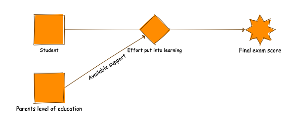
Our student exam example entails some causal relationships as well:
Effects on exam scores
This makes intuitive sense. We can use hyphothesis tests to estimate how pronounced the effects of our cause are. When we can be reasonably certain that we eliminated different possible biases, causality can be an excellent tool to model some classes of problems.
As we encode our domain knowledge into an algorithm, all we need to do is to specify a set of rules (e.g a finite state automaton). Causal inference is computationally cheap and explainable.
However, as the problems we are trying to model grow in complexity, causality can become unwieldy to adapt. As always, we need to carefully evaluate if our chosen paradigm can fit to the problem at hand.
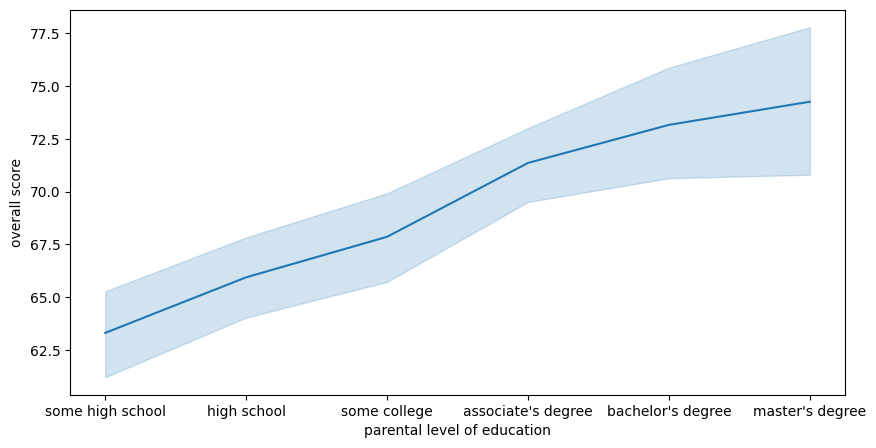
From explanation to machine learning
The first six chapters of modelling mindsets are dedicated to describing data. A radically different approach is to demand our computers to do the work for us. For instance, we can ask the computer to learn the relationship between parental level of education and overall score. To model this problem, we should first map the education level to categorical values (essentially numbers), which are understandable for computers.
Figure 4: Relation between parental level of education and overall score of a fictional exam dataset
This figure suggests that parental level of education is a good predictor for a student’s overall score. To test if that is true, we may create a linear model to predict the overall score from the student’s parental level of education. In order to do so we follow well-established steps
Preprocess your data
Inspect input and discard defect rows
Encode variables numerically
Scale or normalise your data
Split your data into training, testing and possibly validation (cross-fold if we are being vigilent)
Pick your model (in our case we suggest a linear model)
Pre-estimate hyperparameters on a development set using hyperparameter exploration
Train your model
Evaluate your model and report a useful metric for your problem (for classification this is usually F-metric)
Since the machine learning playbook is well known that’s exactly what we will be doing.
Teaching this to a machine isn’t as trivial as it appears. Our F1 score is 0.28, so we are a lot worse than simply guessing the parent’s level of education. Upon closer inspection of the input data, we find our old nemesis (sample size) at work again. With 18% of the data representing bachelor’s and master’s degrees, it is unsurprising that the algorithm has a difficult time to differentiate students into 6 classes.
Code
from collections import Countercounter = Counter(df["parental level of education"])labels, sizes =zip(*counter.most_common())fig, ax = plt.subplots(figsize=(10, 5))colors = sns.color_palette("muted")[0:5]ax.pie(sizes, labels=labels, colors=colors, autopct='%.0f%%')plt.show()
Figure 5: Percentage of student by their parental education level
This example highlights some of the unique benefits and issues that one has to consider when opting for a machine learning model:
we need to have good domain understanding of the input variables, and even so, some problems cannot trivially be learned
machine learning algorithms are data hungry
they can help us quickly build useful things (most of the code for this classifier was just copy-pasted from the scikit documentation)
Luckily we are not restricted to supervised learning. There’s a treasure trove of methods which can aid us make sense of data. This is where unsupervised learning comes into play (consequently, semi-supervised learning may combine the best of both worlds).
Unsupervised learning
If we wanted to inspect the relations between gender, race, parental education, lunch and test preparation course in relation to the overall score, we can use a pairplot to make some sense of our data. However, discovering patterns between multiple variables is not trivial. This is where unsupervised algorithms can come in handy. As always, when in doubt, visualize the data first. We can use TSNE, a unsupervised manifold algorithm, which allows us to reduce the dimensionality of our input data from 5 to 2, which is more sensible to humans.
Code
from sklearn.manifold import TSNEencoded_df = pd.DataFrame()for column in ["race/ethnicity", "lunch", "parental level of education", "gender", "test preparation course"]: encoder = LabelEncoder() encoded_df[column] = encoder.fit_transform(df[column].values)X_embedded = TSNE(n_components=2, learning_rate='auto', init='random', perplexity=3).fit_transform(encoded_df)x, y =zip(*X_embedded)fig, ax = plt.subplots(figsize=(10, 5))sns.scatterplot(x=x, y=y, hue=df["overall score"])plt.show()
Figure 6: Manifold representation of different variables and in relation to overall score
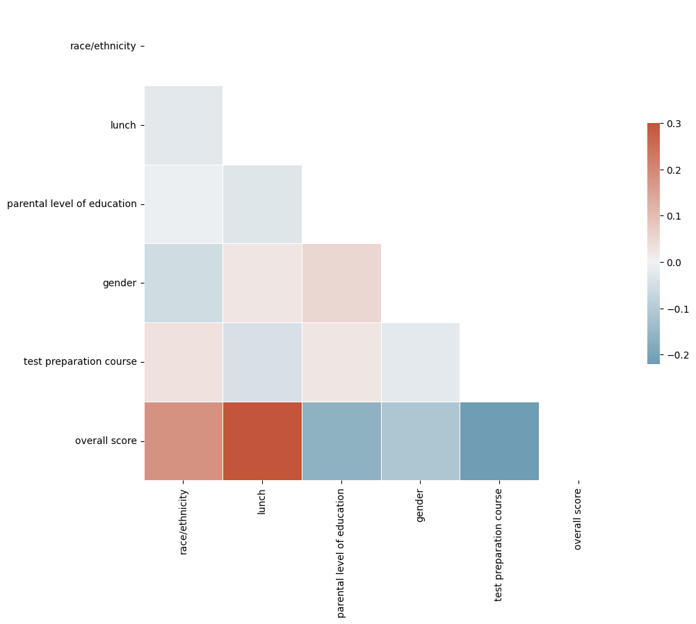
If this data leaves you clueless, you’re not alone. There aren’t any obvious groups to be found. Therefore, one possible conclusion is that our variables are independant. Since this is a pet dataset, it may very well be the case. If we want to be good data scientists, we should follow up on this intuition and look at the correlation of different variables. We may do so using a correlation heatmap.
Code
# Compute the correlation matrixencoded_df["overall score"] = df["overall score"]corr = encoded_df.corr()# Generate a mask for the upper trianglemask = np.triu(np.ones_like(corr, dtype=bool))# Set up the matplotlib figuref, ax = plt.subplots(figsize=(11, 9))# Generate a custom diverging colormapcmap = sns.diverging_palette(230, 20, as_cmap=True)# Draw the heatmap with the mask and correct aspect ratiosns.heatmap(corr, mask=mask, cmap=cmap, vmax=.3, center=0, square=True, linewidths=.5, cbar_kws={"shrink": .5})plt.show()
Figure 7: Heatmap of correlations between different variables
As suspected, there is no significant correlation between the different variables. Further, the correlation heatmap reveals that we should have trained our predictor on the relation between lunch and overall score, which appears to be strongly correlated. Unfortunately, improving our predictor beyond using the lunch variable will be difficult. If other variables are indeed strictly independant, this will also rule out additive and linear mixed models.
Learning to test (deep learning)
We’ve exhausted the statisticians playbook, but we’re not quite done yet. There are other things still that we can try! Instead of making explicit assumptions about the distribution of our input, we can try and ask our computer to do even more work for us. We can do so by using neural networks, which “just do the work for us”. This is a strong simplification of all the empirical research which goes into neural networks. For the sake of illustration however, we can rerun our previous classifier as a neural network. scikit-learn lends us an implementation of the multi layer perceptron, which is very easy to plug into our previous classification example. We train our MLPClassifier on the variables race/ethnicity and lunch and ask it to predict the resulting overall_score in American grading scale for us.
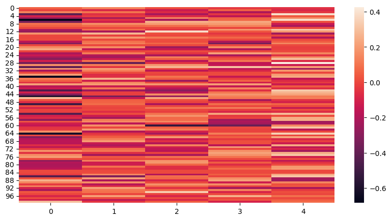
Indeed, our perceptron classifier can learn a stronger relation between our input variables and the resulting grade. A students however appear to be non-existent. We know this cannot be true, as the support is 34 (and therefore there are A students). This showcases some of the unique strengths and weaknesses of deep learning algorithms. We are able to train a classifier which outperforms our linear model out of the box. As to why it has issues with some classes however is difficult to interpret (at best). One way to inspect the model can be:
look at the final hidden state
plot a heatmap
identify which neurons permanently stay (de)activated
Let’s try our best with the MLPClassifier we just trained.
for category 0 (class A) we have strong activations (yet it isn’t predicted?)
for category 0 we have activations all across the board (this is probably bad)
for other categories we have strong activations around the 60th layer
generally the activations are sparse and we can’t really see any patterns emerge
As with other paradigms, there are classes of problems where only deep neural networks can help (think of LLMs, image generation etc). This comes at the price of interpretability. Where we could clearly (and completely) explain our linear model, doing the same for a deep neural network is fairly difficult.
Conclusion (t-shaped modeler)
My takeaway from modeling mindsets is to stay pragmatic and open to all the branches of computational statistics. Different problems require different solutions. In this sense, it is best to become an expert on any one of the areas introduced (the one most useful or enjoyable to you). In the same sense, if you have become an expert, your routine way of modeling can not apply to everything, and you are free to lend any (or all) of the other areas of computational statistics to help you solve the issue at hand.
Certainly I have learnt my fair share by just building out the different sections of this blog post, solidifying my own expertise and entering other areas that I am not usually as confident in. It was a fun ride! Lastly, if you haven’t bought the book yet, you should.
Reinforcement learning
In the modeling mindsets book, chapter 9 is reserved for reinforcement learning. While certainly very interesting and deserving of its own chapter, I found it not to be applicable to the data at hand. We don’t know the questions of the exam, so we can’t really simulate its results. If you do have an idea how this would be modeled, please drop me a mail!